Peter Beverloo

G+: peter.sh/+
Twitter: @beverloo
Blog: peter.sh
Paul Kinlan

Twitter: @paul_kinlan
Blog: paul.kinlan.me
Survey
Who has a smartphone?
Who has a 24 inch phone?
Who has a dual screen 24 inch phone?
Who loves typing on a phone?
Who has a gigabit ethernet phone?
Who uses their phone as a desktop?
Mobile is different
- The screens are smaller
- Users are mobile
- Input. is. harder.
- Unique hardware capabilities
- Everything is slower
Key
Availability
- Supported Today
- Brand New
- Upcoming API
Platform Support
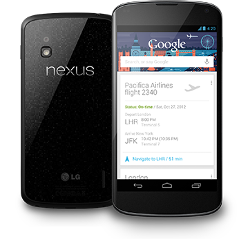
 Chrome for Android
 Android Browser
 iOS Safari
 Internet Explorer 10 Mobile
 Firefox Mobile
 Opera for Android (Beta)
The screens are smaller
What can I do?
Viewport
The most critical element for mobile!
Device width:
<meta name="viewport" content="width=device-width" />
Initial scale:
<meta name="viewport" content="initial-scale=1.0" />
<meta name="viewport"
  content="width=device-width, initial-scale=1.0" />
Demo: goo.gl/j9KLT
Device Adaptation
A saner solution is on it's way!
@viewport {
  width: device-width;
  orientation: portrait;
}
Greater flexibility when used with Media Queries:
@media screen and (min-width: 800px) {
  @viewport {
    width: device-width;
    user-zoom: fixed;
    zoom: 1.0;
  }
}
Media Queries
Adaptive to screen size
@media screen and (min-width: 800px) { ... }
@media screen and (device-aspect-ratio: 16/9) { ... }
@media screen and (resolution: 2dppx) { ... }
- Logically group your styling rules.
- Dynamically responsive.
Orientation
Mobile devices can usually be rotated
@media screen and (orientation: portrait) {}
@media screen and (orientation: landscape) {}
Demo: goo.gl/SgMEo
Viewport units
Sizing relatively to the viewport
#visible-square {
  width: 20vmin;
  height: 20vmin;
}
- Four new units: vw(idth), vh(eight), vmin and vmax.
- Relative to the size of the viewport
Value is 1% of width/height of the viewport
1vw = 1% of the viewport width
1vh = 1% of viewport height
Demo: goo.gl/J5tna
Flexible Box Module
Adaptive layouts
element {
  display: flex;
  flex-direction: row | row-reverse | column |
      column-reverse;
}
- Adaptive to display size.
Spec: dev.w3.org/csswg/css-flexbox/
Demo: goo.gl/lCRr6
position: sticky
For The Win!
- Initially a relatively positioned element.
- Becomes like position: fixed when parent partially out of view.
- Hidden when parent is completely out of view.
.sticky-element {
  position: sticky;
  top: 10px;
}
Demo: goo.gl/AYZhw
Users are mobile
What can I do?
Geolocation
Request the current position once
var success = function(position) {
  var latitude = position.coords.latitude;
  var longitude = position.coords.longitude;
};

navigator.geolocation.getCurrentPosition(success);
Or keep track when they're on the move!
var watchId = navigator.geolocation.watchPosition(
    function (position) { ... });

// Stop watching when you're done.
clearWatch(watchId);
Device Orientation
Events when the device's orientation changes
window.onorientationchange = function(event) {
  var yaw = event.alpha;
  var pitch = event.beta;
  var roll = event.gamma;

  // You could make a compass!
};
Demo: goo.gl/zNvp3
Offline Events
Determine the network state
window.navigator.onLine
wwindow.addEventListener("online", function() {
  console.log("Visitor might be online.");
});

window.addEventListener("offline", function() {
  console.log("Visitor is definitely offline.");
});
- Very hard to know for sure whether the visitor is online.
- And what if the server is unavailable?
Demo: goo.gl/Bgmcp
Application Cache
<html manifest="website.manifest">
CACHE MANIFEST
#version 1.2013.5.16
css/bootstrap.min.css

#Images
img/paul.png
- Will also be used when the user is online.
- Allows you to define fallback pages.
- Don't cache the manifest!
Demo: goo.gl/3fO2I
Storage APIs
| Intuitive API | Powerful Querying | Asynchronous | Widely supported | |
|---|---|---|---|---|
| localStorage | Yes | No | No |
|
| WebSQL | Yes | Yes | Yes |
|
| IndexedDB | No | Yes | Yes |
|
What is a developer supposed to do?
Storage APIs
Use abstractions
- Lawn Chair - brian.io/lawnchair/
- asyncStorage - https://github.com/WebReflection/db
- IndexedDBShim - nparashuram.com/IndexedDBShim/
Input. Is. Harder.
What can I do?
Semantic input types
Specialized on-screen keyboards
<input type="email" />
<input type="search" />
<input type="url" />
<input type="tel" />
<input type="number" />
<input type="date" />
<input type="week" />
<input type="month" />
<input type="datetime-local" />
Demo: goo.gl/CNMp6
Touch Events
Handle the visitor's touches
[element].ontouchstart = function(event) {};
[element].ontouchmove = function(event) {};
[element].ontouchend = function(event) {};
Warning: 300 millisecond click delay.
Docs: goo.gl/8ybb5
Demo: goo.gl/ZwOzk
Pointer Events
Various new JavaScript events available
onpointerdown, onpointerup, onpointermove, onpointerover,
onpointerout, onpointerenter, onpointerleave.
More fine-grained support through CSS
touch-action: none | auto | pan-x | pan-y;
@media (pointer: coarse) { }
@media (pointer: fine) { }
Demo: goo.gl/00WGG
Unique Hardware capabilities
What can I do?
Camera - Media Capture
Take photos
<input type="file" capture accepts="image/*" id="cam">
var cam = document.getElementById("cam");
cam.onchange = function(event) {
  // An image has been captured.
  if(event.target.files.length == 1 &&
     event.target.files[0].type.indexOf("image/") == 0) {
     // We have an image, most likely from a camera
  }
}
Demo: goo.gl/Ofs5z
getUserMedia
Inline camera and mic access
navigator.getUserMedia({audio:true, video: true},
  function(stream) {
    // An image has been captured.
    video.src = URL.createObjectURL(stream);
    video.play();
});
Demo: goo.gl/0JrXM
Android Intents
Interacting with native apps
intent:
  HOST/URI-path // Optional host
  #Intent;
     package=[string];
     action=[string];
     category=[string];
     component=[string];
     scheme=[string];
  end;
<a
  href="intent://scan/#Intent;scheme=zxing;package=com.google.zxing.client.android;end">
  Take a QR code
</a>
More information: developers.google.com/chrome/mobile/docs/intents
Demo: goo.gl/Kpk0C
Fullscreen
The old way
window.scrollTo(0,1);
The new way
[element].requestFullscreen();
[element].currentFullScreenElement();
document.cancelFullscreen();
document.fullscreenEnabled();
document.isFullScreen();
Demo: goo.gl/QrYRz
Everything is slower
What can I do?
Navigation Timing API
onload()
Navigation Timing API
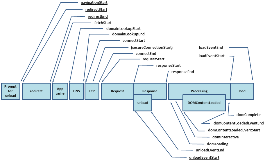
Resource Timing API
Programmatically understanding the network
var perfEntries = performance.getEntriesByType('resource');
for (var i = 0; i < perfEntries.length; i++) {
  console.log('Name: ' + perfEntries[i].name +
    ' Entry Type: ' + perfEntries[i].entryType +
    ' Start Time: ' + perfEntries[i].startTime +
    ' Duration: '   + perfEntries[i].duration  + '\n');
}
Demo: goo.gl/BYUe3
chrome://flags
WebRTC
- RTCPeerConnection
- RTCDataChannel
Use a library:
- Webrtc.io
- Easyrtc
Web Audio
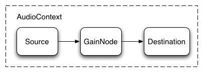
var source = context.createBufferSource();
// Create a gain node.
var gainNode = context.createGain();
source.buffer = buffer;
// Connect source to gain.
source.connect(gainNode);
// Connect gain to destination.
gainNode.connect(context.destination);
- Only available on ARM devices supporting the NEON chipset.
Demo: goo.gl/Mr70x
WebGL
- It's too complex to show much of a demo :)
Is the mobile web awesome yet?
- adapt to screen sizes
- accommodate users on the move
- speed up input
- integrate with device features
- measure performance across all devices
- look forward to WebRTC, Web Audio and WebGL
We can:
Yes! It is awesome!
And it will keep getting awesomer!!!